Apple
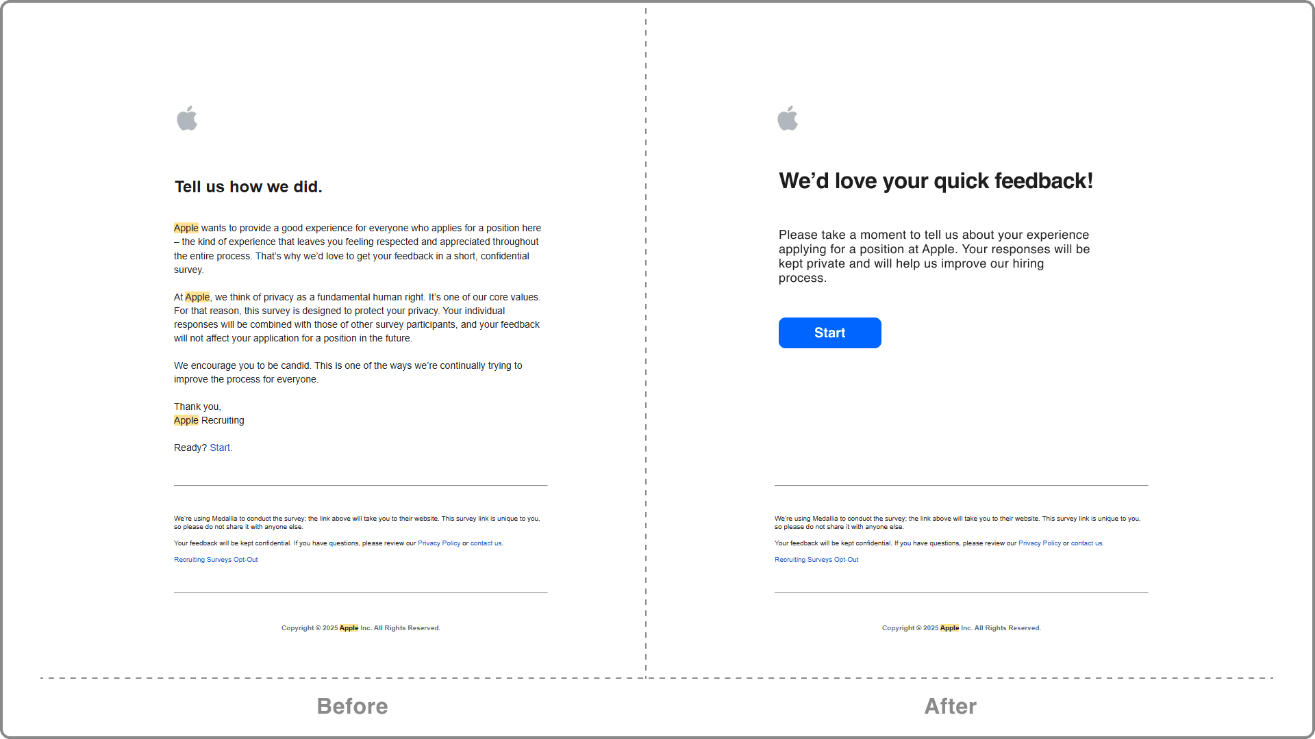
Improved CTA visibility & hierarchy

Project Overview
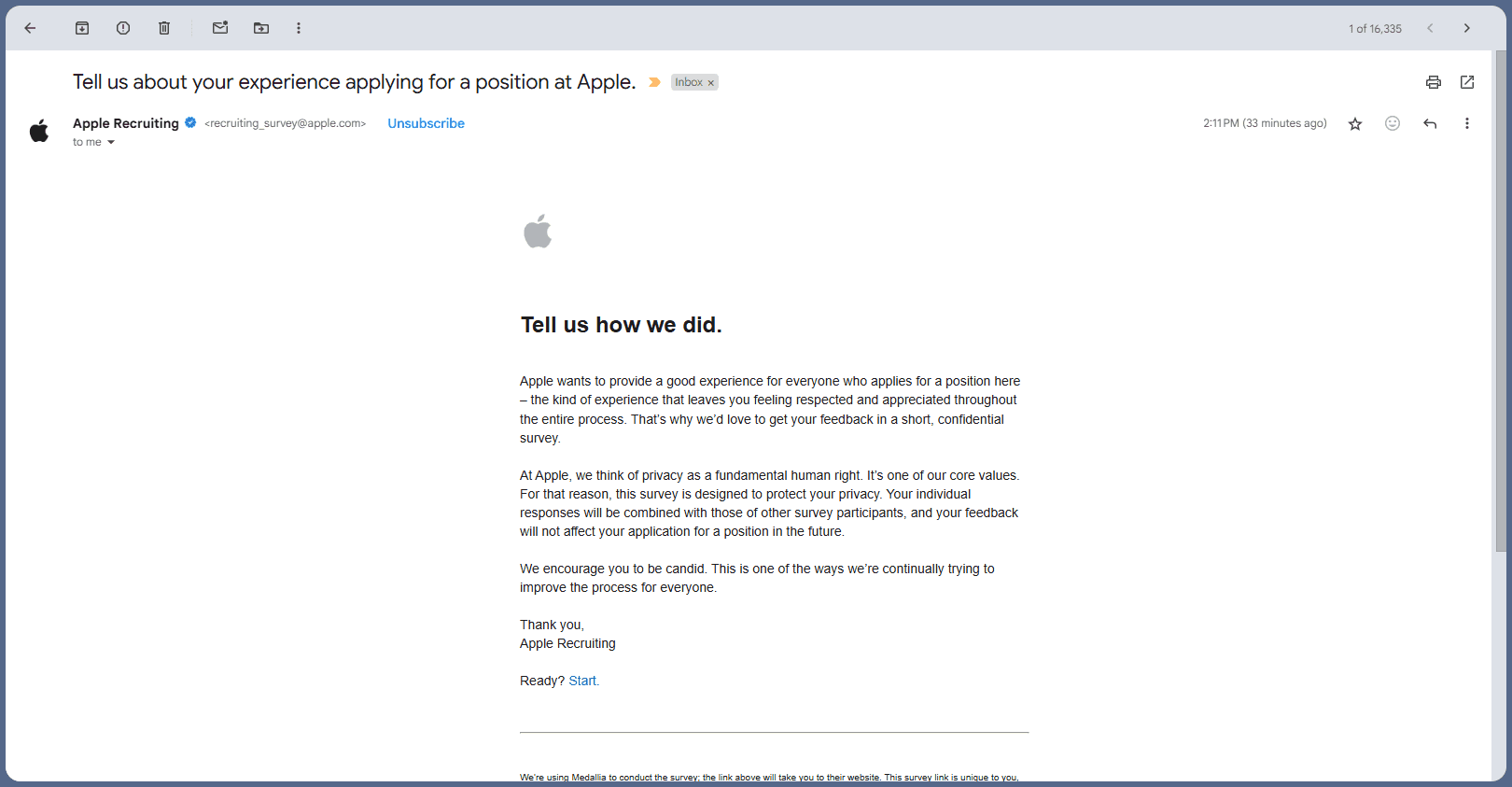
The purpose is to evaluate and improve the user experience of a survey invitation email received from Apple Recruiting.
This case study highlights usability issues in the email’s layout, clarity, and CTA visibility, and proposes a user-centered redesign.
Read time:
5 Minute
Problem
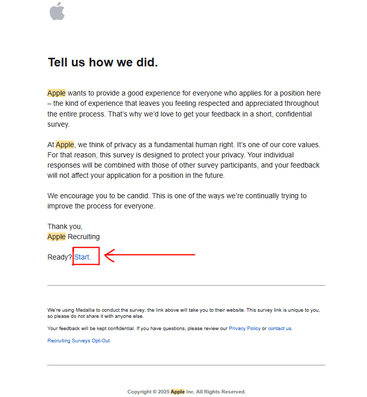
Unclear CTA: The most critical action (“Start” link) is buried and styled as body text, making it easy to miss.
Visual hierarchy is weak: No scannable structure, so everything feels like a wall of text.
High cognitive load: User must read the whole email to find out what to do.
Poor affordance: No button or highlight to draw attention.
Misaligned with Apple’s usual sleek, intuitive standards.
UX Heuristics Violated
Visibility of system status:
The email doesn’t immediately show what action is expected.
Recognition over recall:
The CTA is not visually recognizable as a clickable action.
Aesthetic and minimalist design:
The design is plain but not functional. Minimalism shouldn't sacrifice usability.
User control and freedom:
No alternate CTA or scannable summary that helps user act quickly.
Suggested Improvements
a. Improved Visual Hierarchy
Break content into digestible sections with headers.
Add bullet points or bold highlights for key messages.
b. Stronger CTA Visibility
Replace the "Start" link with a primary button and large, high contrast.
Position the button right below the first paragraph (above the fold).
c. Reduce Cognitive Load
Move important content to the top.
Use plain, concise language.
Summarize the purpose and ask in 1-2 lines max.
Takeaways
Importance of CTA visibility in communication design.
How minimalism can fail without functional hierarchy.
How small tweaks in UI copy and structure can greatly enhance usability.